Wednesday 25 January 2012

Structure Again!


Up to now I’ve been thinking about two different approaches. The first is image driven based on charcoal sketches. These are developing into a night time journey around/to the tower. I put several of these together in a simple structure to see how they work.


Although I’m enjoying the drawing and they are a good warm up when I get into the workroom I don’t think they work for this book. I’d like to develop this into a more long term project (similar to ALAW ) and take them on a longer journey. So I’ll shelve this approach for now.

The second approach is structure driven developing the idea of the tower/half cover from last week.
I’m considering the use of embossing to provide some of the detail, a plait or possibly the rampion (Rapunzel plant). This design works well for printing as it folds back on itself so I can effectively print both sides in one pass


Although I like the symmetry of the design I am having problems with this construction. When I fold the tower to the left and then to the right it bows slightly as I flatten it down. Also the crease thickens.  I need to try it with very accurate measuring and different printing weight papers.
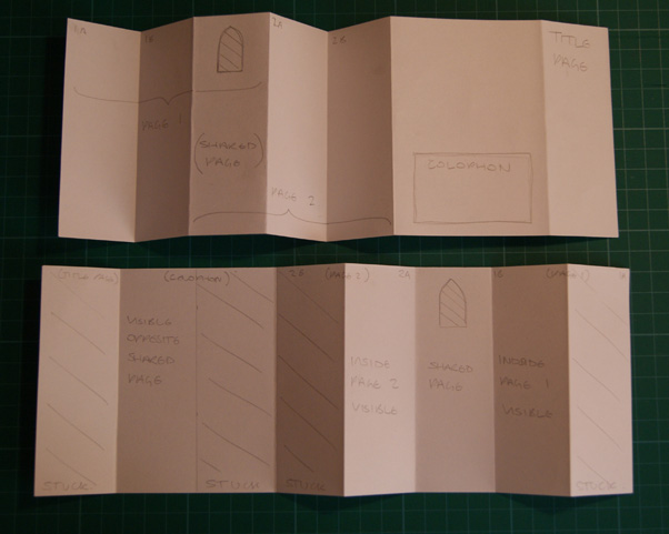

As I was sticking one of these together (to see how some of  the images I am considering using work in 3D) I made a mistake and ended up with no pop out tower but with a series of interlinked pages that can be folded and opened in different sequences – I might come back and explore this idea later 


I have been thinking about the images I may use and have started to play with silhouettes. I’m not sure if I want to include the prince or if he is just a bit player in this story. 


Friday 20 January 2012

More thoughts on structure


I’ve sort of set myself the target of updating this every Friday – I figure if I have to find something to say it will be a spur to getting things done.
I think I’m going to need that push. The reality of being back at work is beginning to bite. I’ve not managed much on the book front this week (although I did make it to the life drawing group after work on Wednesday)
I have played more with the idea of structures, towers and windows. From the very simple.


To the far too complicated for an edition.


To something that I’m certain I’ve borrowed from somewhere but I can’t put my finger on it


I quite like this idea of the tower in the middle
 

 Although the original story does say there is only one window I may choose to ignore that.


I especialy like this different construction which means that when it's folded you can still see the front face of the tower next to the cover.


Saturday 14 January 2012

More Drawing

Still feeling my way through this.

Part of me is responding to the fairy story connotations of the titile and wants to produce a series of images/prints (I tend to think in charcoal.). This is the me that collects childrens books
(though I usually prefer Shaun Tan and Dave KcKean to the more traditional approach.)


The other part of me thinks I should be responding more to themes contained within the original fairy story, Ideas such as imprisonment, isolation, unsucessful protection from loss of innocence. Probably using a more structural, less literal approach using motifs associated with the story.


I'm going to give myself time to play before making decisions. One thing does seem to be evolving though - a response to the tower. So far everyting seems to be tall and thin.


Friday 6 January 2012

Some Success

First step - a trial image to see if charcoal will translate into print.


Charcoal drawing photographed, made more contrasty in photoshop and then printed on my ancient laser printer. I remember reading somewhere that you can use laser prints as well as photocopies for this process.
Not very successful - don't know if its my technique or the copy.


 Next step - trip to the corner shop with injet printout of image (and of image with text added) to see if their ancient photocopier will make better plates. This is more sucessful but still not as much detail as I wanted.


Decided to try printing the photocopy with text onto a different, smoother paper. Much better.


Spot the deliberate mistake ( I forgot to reverse the image). The text may be backwards but the finelines are printing.

The plus side of the process is that printing plates will be cheap and easily altered. I also like the slightly distressed look. The downside is having to clean up the roller and the slab in between each printing becuase the gum arabic and the transfered paper fibres make a real mess of the ink.

Tuesday 3 January 2012

Considering Media

 I'm thinking of printing the images for my book using gum arabic transfer printing. I did a course once! I'm not sure if I can replicate the method after so long nor if it will work well for photocopies of drawings (for the course I used copies of old maps and photos of museum artefacts) but if it will I don't need to worry about spoiling plates or plates wearing out as I would with drypoint or collagraph


I have at the back of my mind an ideas for a second book (if no one else wants the titile) which will use etching so I don't want to use that technique for 'Rapunzel'

Sunday 1 January 2012

Starting Rapunzel

Thought I'd use this 'test blog' to record the progress of Rapunzel

I started by thinking about structure. I’ve never made an edition before – simple is probably best. So I played with stab binding.

Basic. Then more decorative - thought this looked like bodice lacing or turn it 90 degrees and it’s more like ridge tiles. Can you add more to make it more like roof tiles?

If you’ve got a roof can you make the body longer-more like a tower?

How long can it be?

Need to start thinking about content. It’s no good having the most beautifully stitched roof if the content is the wrong shape

Content - Initial thoughts

· not a retelling of the original story but something with links/signifiers (hair, tower, no doors, thorns are the ones that spring to mind)

· would like to develop some kind of narrative - a storybook response should have a narrative?

· want to avoid characters - editioning a set of books is a difficult enough challenge without having to develop a set of recognisable characters

Initial sketches

I seem to be naturally drawn to working long and thin.