Tuesday 28 February 2012

Rethinking Rapunzel?

Over the last couple of weeks I made a collagraph block to experiment with using silhouettes and shapes.


  I found when trying to ink it that using Pritt stick to glue it together before varnishing may work for the larger shapes but certainly doesn’t on the trees-they kept lifting. I had to ink and wipe sparingly. The colour scheme is a bit garish but I think I could develop the composition. Possibly into etching as it would be easier to wipe uniformly for an edition. As usual I think I like the plate better than the print.


We visited Castell Coch near Cardiff last weekend. The castle fell into ruins in the early 14th century but in 1875 it was transformed by the architect William Burges and John Patrick Crichton-Stuart, the third marquis of Bute. It is a wonderful Victorian gothic fantasy and well worth a visit.


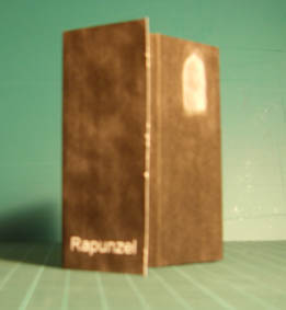
It also got me thinking. If my benevolent witch wanted to protect Rapunzel would she lock her up in a single room at the top of a tower? Would she be more likely to provide an enclosed safe space that Rapunzel could live in comfortably? A tall castle complex, with no windows on the external walls but with windows opening onto an interior courtyard could provide comfortable space and fresh air and also isolate the inhabitants from the outside.


 I’m not sure if I will follow this line of thought or stick with the more iconic tall thin tower

 Arriving home on a grey wet Monday I received a package from Amanda - a zine, small red and shiny, beautiful textures. It cheered me up. Thank you.


Thursday 16 February 2012

Butterflies


I started to explore. I’d like to etch for this book and have rather a lot of 10cm square aluminium plate (it seemed a good idea when I bought it) which is a starting point
The initial thought was to combine the idea of life within the church yard with reminders of the dead. I have this vague idea of using different weights of paper, possibly transparent or translucent papers, interleaving other print methods with the etchings.
But first I wanted to experiment with etching.  I decided to use a butterfly motif, set amongst the grass. I started by masking out the butterfly and using straw hat varnish to progressively mask out the grasses. The new copper sulphate solution was a bit more lively than I anticipated and although I like the appearance of the plate (it has bitten in steps) it doesn’t print well even on heavyweight paper.


Cutting the etching time, the butterfly on a plain ground was more successful. Still a bit over bitten but white acrylic paint printed onto the plate from embossed wallpaper worked better than I expected.

 
Back to the grasses and I tried using acrylic ink as a resist. I found that it’s much easier to make a painterly mark with this than the varnish. It also stood up to etching quite well. It gave a partial resist where the ink was thinner and a complete resist where it was thick.


This was much better. I decided to ‘add’ the textured butterfly. A mistake, although it etched OK it was too similar to the ground, neither read very well.

 
Scrapping and burnishing took the wings back a bit and put more detail into the body. I’m not completely happy with it but I’ve learned a lot.


Where the dead live


I’ve signed up for two titles for BAO.  ‘Where the dead live’ is the second (group 10).

To me they live initially in the memories of those that knew them. But later as these people also become memories they live on in the things they left behind. This could be a name on a gravestone, the ruin of a house they once lived in, an artefact in a museum or junk shop.... The pictures and stories we see and tell about them may be no more than conjecture and imagination but while we do there is still some trace of the original person left.

I spend quite a bit of time photographing and drawing in ruins and cemeteries so for me this is the obvious starting point. As usual I’ve got more than one idea floating around.

The first grew out of time spent at St John’s in the Vale, near Ingleton. My husband and son go climbing nearby, I go drawing and watch the bees, butterflies and birds. It’s a very small, old country church with a beautiful graveyard, not overgrown but not too manicured either. I have this vague idea about combining inscriptions and memories with regeneration/life cycles.


The second came out of time spent in the town cemetery of Argeles sur Mer. I love the small mausoleums that French families used (and still do in some cases) – almost houses for the dead! I started a set of work based on these last year but thought, apart from me, who’d want work based on such odd subject matter. So I shelved it.  Now I have the perfect excuse to go back and work on it some more.


Sunday 12 February 2012

Profiles


I started making sketches of profiles, continuing with the idea of the witch as person rather than a stereotypical baddie in a pointed hat, and developed these into a rough image. I am still trying to get the feel of a renaissance portrait.


 I’ve put this into Photoshop to see what it looks like in the structure that I’m thinking of using so far.


It’s getting there but I think it’s still too literal. I’ll put this on the back burner for a week or two and live with it around the workroom. I've signed up to do a second book, ‘Where the dead live’, and I’ve got some ideas for that that I think I’d like to explore in the meantime.