Saturday 26 January 2019

Letters

I’ve been focusing on letters this week.

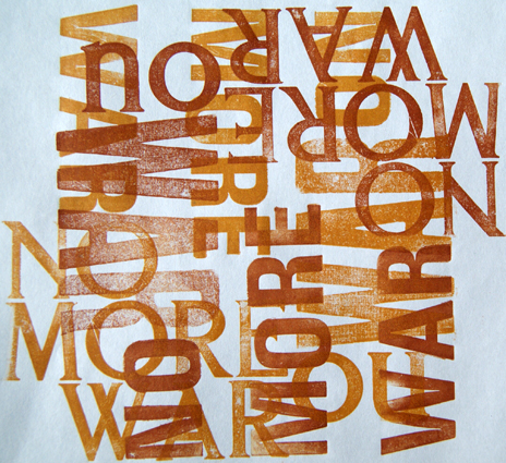
Last summer my four year old grandson gave me a book that he had drawn. As he was explaining it he said ”and that is the fish that ate my words”. I thought that was a great idea for a book or print and I’ve been looking for the words ever since. He came to stay in November. He had been learning about the centenary of the end of WW1 at school and he chanted himself to sleep. “No more war, war is bad, we want peace, peace is good”. I’d found his words.

Some experiments in letterpress with wooden type
and metal type
I’ve also been trying to push the asemic writing book further on. The inks that I was playing aren’t drying and I’ve come to the conclusion that my freehand writing skills leave a lot to be desired.
So I started to look at constructing single letterforms that looked convincing.


I tried them on pages (boring)
And as cut outs (too geometric)
And more cut outs. I liked this one but it is only 7 cm high and when its enlarged it’s too crude
So I’m trying adding more letters.

Wednesday 16 January 2019

Experiments with monoprint


I’ve taken on several different projects recently, all with quite short deadlines. I decided that while I had monoprint stuff set up at home it would probably be a good idea to explore possibilities for a couple of them at once.

So here are trace monoprints for the Blackpool pier project...
And some playing with text for the asemic writing...
 And some ink letter play using different nibs...
And some fountain pen and overlapping colours.
 All small steps and some more successful than others but at least both projects are making some progress.

Wednesday 9 January 2019

Asemic Writing


I’ve started work on book number 21 for Collaborative Artists Books 3.0. Our title for this one is asemic writing.

I’ve been thinking about how to define it for the purpose of this book. To me it seems to be a set of purposeful marks that look like a system/code to convey language, which adopt the mark making conventions of pictogram or script in terms of shapes, grouping and direction of travel. Generally the groups of marks appear to have a stylistic coherence.

The books themselves will be 15cm x 10.5cm(postcard sized) when folded so I’ve decided to start by playing with materials and forms, making samples and mounting them on postcards. When I’ve finished I’ll bind these into a book as a sketchbook record of how I got on.

First record cards
It's much more difficult than you’d think

Tuesday 1 January 2019

Every.....

At one of the November meetings of the Art Society we launched our new project/competition, “Every line, every shadow, every shape, every curve (and every colour)”.
Jill Reidy, a Blackpool photographer, came to show us how she uses these elements in her work and she kindly agreed to let us use the photos from her presentation as a starting point for our own  responses.

I chose this image (follow this link if you want to see more of her work).
I think probably because it reminded me of a painting I made years ago based on this, and similar, photos I took of the pier and prom.
I like the long thin structure of the pier so I decided to make a series of long thin studies from my old photos. I deconstructed a book I’d made out of leftover edges of printing paper (it seemed the right proportions) and started to play with media.
And then added other responses on the back.
I finished rebinding the book this afternoon.

 It’s a sketchbook not my final response, but it is helping me see the possibilities.
 On Boxing Day we made a trip to Blackpool to get some more up to date photos of the ironwork structure. The tide was in so that scuppered that idea but the light was beautiful and moody.