Its time to go back to work but this has been a productive Easter holiday.
I’ve rescued
a chair (It was a 21st birthday present to my mum which makes it
nearly 60 years old and it looked very much the worse for wear) and upholstered
my rag box (which was inherited from my mother in law) to match.
I’ve started
to learn to weave (sounds very grand but I’m only using a simple frame loom)
and had another go at trying to learn to knit. No pictures of either of these. I’ve not
produced anything worth sharing. Tapestry weaving is something I’ll continue with. I’m really enjoying playing with
colour and texture without having to ‘make something’. But knitting! It’s one of those basic skills that I feel I
ought to be able to master and every now and then I have another go. I think its
back to the bottom of the cupboard for now for the needles.
On the book
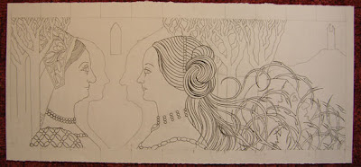
front Rapunzel has moved again (I wouldn’t say it’s made progress, more gone sideways, but I’ve been
busy with it). I decided to push the long thin concertina format for the time
being which meant looking at the composition again. Not only did it have to fit
the format but it also had to make sense as separate panels as well as one
large image.
The collagraph
plate still didn’t work for this so I started to play with extending the
composition. In the meantime it has changed from simple silhouettes to a more
detailed image. It started to make me think of a cross between woodcut chapbooks
and Victorian illustration, especially Morris and Beardsley.
The Victorian
influence fitted in well with the inspiration from Castell Coch and I enjoyed
bringing in references to that type of painted imitation wall tile decoration
in the space between the two women. The motif is based on hawthorn – a plant
that is said to have protective qualities and comes in a variety with seven petals.
Seven being a magic number I thought this was apt for the witch’s interior
decoration.
The strong
white dark contrast should also make it easy for Xerox lithography, or so I
thought.
Problem number one – Staples have changed their photocopier. The
copies from this one aren’t as good to print from as the old one. Problem solved by using the ancient (if
expensive) machine at the corner shop.
Problem
number two – the large areas of black just aren’t printing well and though I
like the worn look for other purposes they make it difficult to read this image.
I think It may also be difficult to produce a uniform edition with such large
photocopies.
Problem
number three – although the copies are large for this process (and my press) they
are only A3. This is making the size of the book, when the image is folded into eleven panels, feel a little on the mean side
On the
positive side with the Xerox litho, I did print copies of the collagraph plate.
I don’t want to use it for Rapunzel but I think there are possibilities here that
I want to explore for ‘Where the dead live’
I have
decided to try working in relief print for Rapunzel, lino rather than wood, which means I
can scale up the block. I'll have to loose the hawthorne motif - far too complcated for my cutting skills, but on reflection when I've seen it printed it looks a bit too busy for the rest of the image anyway. So far I’ve only tried a test cutting piece and still have to
print it.
Printing may
have to wait a while. Next weekend I’m off to the Hot Bed Press in Salford to a Japanese
Woodcut Course - a much appreciated Christmas present from my kids.


