Here is the
block...
And one of
the prints.Sunday, 21 June 2015
Saturday, 13 June 2015
Gum Arabic Again
In between enjoying a new grandson at home and going to Skye for a very waterlogged week with the old one I somehow
haven’t got round to posting recently.
I’ve been
exploring gum arabic printing further with some larger prints.
(The scanner seems to have leeched all the colour out of the following ones)
(it took a
while to get the pressure right)
And more
colour separations
(this is a
larger better version of earlier experiments)
I‘ve also been
building on the collagraph work I did for ‘Fragments’ and have been designing a
larger, more complicated block which I
hope to print later on this week.
Monday, 18 May 2015
Fragments
As part of
Collaboration 15 on Artist Books 3.0 it was suggested that we should produce our own
narrative. Although I read a lot and much of my work is produced in response to
other peoples words actually writing them myself is way out of my comfort zone.
I was amazed at how much I enjoyed it.
On Formby Beach
was the book I made for the swop edition but I have just finished the prototype
of another book written in response to a bleak February afternoon spent at a
local museum
Saturday, 2 May 2015
Footprints in the sand
On Formby beach the erosion of the
sand has revealed footprints that date back to the late Neolithic era.
Whilst on a walk in 2012 with friends
we were lucky enough to meet a group of archaeologists standing round a black
patch on the sand which had clear small footprints sunk into it. We were
looking at the marks left by a child running across the mud 7000 years ago.
Three years later an edition of twelve books remembering the day
Wednesday, 22 April 2015
Final stages
The prints
are out of the pressing boards and are hanging to make sure they are
completely dry.
I’ve been
experimenting with making book cloth to for the covers.
I chose plain
linen. The colour works well with both the first print and the ghost print from
each inking. I’m making small pieces of cloth because the only thin strong paper
I had to hand on Sunday night was from an A4 layout pad. It does mean that the
wet layers are quite easy to manipulate which is an advantage.
Sunday, 12 April 2015
Moving forward
I’ve been
working but haven’t got much in the way of pictures to share this week.
The long
collagraph plate worked - 6 prints and 6 ghosts. Unfortunately I forgot to
photograph any before I put them under weights to dry.
I’ve
finished the mock up for the other book I was thinking about, also using collagraphs.
It’s at the scrap paper and scribbles stage, so not very pretty.
But I did cut
and assemble the coloured ‘Twelve dancing princesses’ risograph prints. The
offset colour looks almost deliberate when you see them all standing together.
Sunday, 5 April 2015
Making the block
Eventually
this will be an accordion fold book (fingers crossed).
It’s a combination
of cutting into the plate and applying a heavy texture gel and a plaster/PVA/water
mix. The red speckles have come off the sequin waste I’m using to make a bubble
texture, I’m hoping the foil won’t print.
It needs a couple of days to dry out thoroughly then a few layers of shellac before I print it.
Sunday, 29 March 2015
More collagraph
I’ve been experimenting
with different mediums and tapes to find out how to achieve the effect I want
for two different books.
This are the outcome of cutting and tearing the plate and using gel medium
and this using a plaster/PVA/water mixture. I am trying to get the effect of the tide line on the beach (hopefully making the most basic mistake of cutting the text the wrong way round on the sample will mean I don't do it on the final block).
This is made by using different tapes and by cutting into the board. It is for a book about museum collections.
This are the outcome of cutting and tearing the plate and using gel medium
and this using a plaster/PVA/water mixture. I am trying to get the effect of the tide line on the beach (hopefully making the most basic mistake of cutting the text the wrong way round on the sample will mean I don't do it on the final block).
This is made by using different tapes and by cutting into the board. It is for a book about museum collections.
Friday, 13 March 2015
Collagraph
I’m giving
the riso prints plenty of time to dry before I start to cut and fold them into
books.
I’m really pleased with the prints from this second method. I think I’ll try using this method of working for the next book swop I’ve signed up for at ArtistBooks 3.0.
In the mean
time I’ve been to Hot Bed Press for a collagraph course. I’ve experimented with
the basics before but have never been happy with the results. However I now
know how to avoid white marks where the plate changes level and how to stop the
plate randomly sticking to parts of the paper.
We worked
with a quick method, using tape and drypoint on Perspex
and a slower
way, cutting into mount board. This needed sealing with several layers of
shellac varnish.
I’m really pleased with the prints from this second method. I think I’ll try using this method of working for the next book swop I’ve signed up for at ArtistBooks 3.0.
Saturday, 28 February 2015
Plan C
The more
scanned drawings I added to the text the more it reminded me of old kitsch
wallpaper (the sort with views of Tuscany interspersed with peppers and Chianti
bottles). Time for Plan C
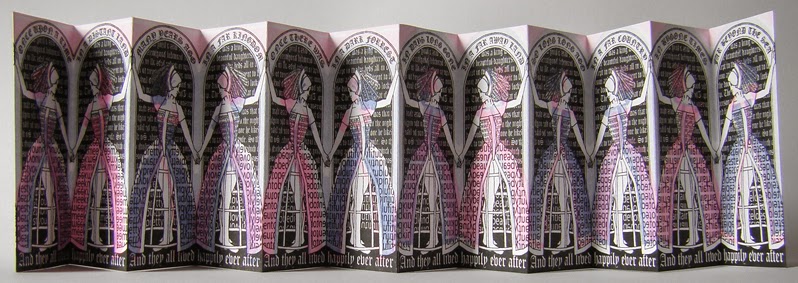
The Barbie colours fit the subject matter. The colour is miss registered which I quite like. It fits the disparity between the feel of the artwork and its commentary.
The object
of the exercise was to experiment with the printer so I decided to see how I
could use it to add text to pre-prepared papers. I made
several different coloured surfaces using watercolour and water-soluble crayons
on cartridge paper, and when dry I ironed them flat.
Some work
better than others, the salt is too busy
but the cling film is really effective
as a background.
I also
revived the artwork from an old idea for a book. ‘Twelve Dancing Princesses’ is meant
to have the feel of traditional fairy story imagery, princesses and delicate
colours, but if you look at the text that makes up the pattern on their dresses it
picks out the qualities that seem to apply to the ‘heroines‘ of many fairy
stories (eldest, youngest-the middle child never seems to do anything
remarkable, kind, meek, dutiful-nothing wrong with them as qualities on their
own but put together its a depressing role model for girls)
I printed
some in black only to hand colour later....
and some in
blue and pink as well.
The Barbie colours fit the subject matter. The colour is miss registered which I quite like. It fits the disparity between the feel of the artwork and its commentary.
The printer
uses soy ink which will take a while to dry completely before I can start to
cut and assemble the books.
Subscribe to:
Posts (Atom)