Wednesday, 4 June 2014

Holidays

We’ve just come back from a wonderful week in Skye.
I collected tiny shells on one of the beaches.I want to use them in a book.
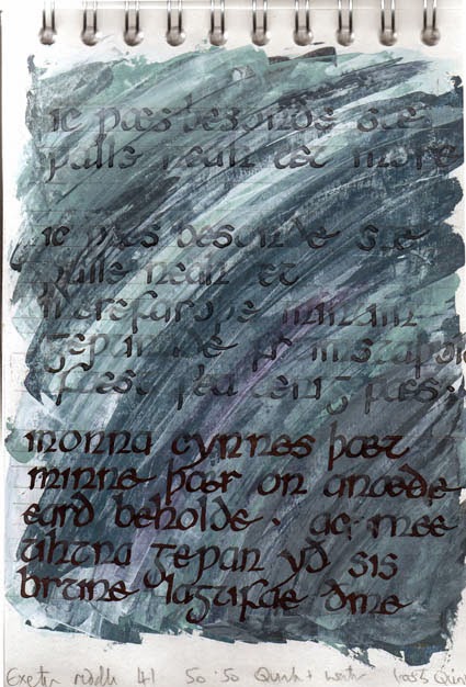
I found an Old English riddle from The Exeter Book (I’m already using part of The Ruin from the same source for the Artists Books 3.0 swop). Although it’s really about a conch shell some of the words seemed appropriate to go with my collection.

Exploring lettering (it’s a long time since I did any serious calligraphy), materials and a palette suggested by the shells and the beach.

Wednesday, 21 May 2014

Flattening the book


I was thinking of making this book so that it could be wrapped to make a star book with three cut out layers; the landscape,the ruin and the words on separate sections.
After putting layers together in Photoshop in order to show here how the sections of the book might look I’m beginning to change my mind.
I'll see what they look like printed at the right size but I think I may go back to a straightforward accordion.

Sunday, 18 May 2014

Back to Digital?

OK, after spending the last week making landscape monoprints I think I’m going to have to give in and print this book digitally. (Does anyone have a printer that they’d recommend? I’m going to have to give in and invest in a new one.)
I’ve managed 6 landscapes that work but they all have many more layers of paint than the original experiments. I don’t think that they will crease cleanly to make an accordion structure, especially when I want to add two other layers to give a sense of depth to the piece.
I’ll still use the monotype process to generate the images though I’m thinking of making each valley into a separate time of day/weather (I can cut and paste scans of the prints to achieve this).  But I also want to try and get a variety of colour changes across the face of the ruin to add interest to the middle layer of the book.
These images are the 84x21 landscapes. The colours don’t come out too well in these photographs; I’ll post more detailed segments when I’ve scanned them.

Saturday, 10 May 2014

Experimenting with structure

I started by thinking about structure.
I decided that I didn’t want to digitally print this book edition (partially because the printer is having a real strop, banding everything - I think it might be time for it to retire). But I also wanted to make the print seem relatively seamless so several separate blocks were probably not going to work.
My solution - monoprints. I decided, on the basis of having so far made 22 tiny alphabet prints for ALAW, that the obvious solution was to use a 25x20cm gelliplate to create 84cm long monoprints.

The first experiments. Exploring landscape...
And  masonry.
This prototype is only 3 segments long but if I add a fourth it will make an accordion which can be formed into a star book.
I'm still not sure abut the covers or what to call it.

Sunday, 4 May 2014

Clearer image

I’ve developed the drawings into two monochromatic paintings.
And I’ve joined them in Photoshop.
I’m still not sure how they’ll develop into the book. This image will give me a book with 4 valleys which means it needs to be 84 cm long. This is far too long for my press but I don’t want to create a set of separate plates. I don’t want to see the joins and I’m not at all confident that I could make and print them seamlessly.

I’ll think about it a bit longer

Sunday, 27 April 2014

Time management?

What do you do when you are already wondering about the time it will take to fulfil the commitments you have made to producing work?

Do you sign up for another project?

The sensible answer is probably not.

I don’t think I do sensible. I’ve just signed up for a book swop on Artist Books 3.0. I think it is turning into a simplified version of the ruined village book I started last year (which I fully intend to finish when I stop signing up for other things)
These are preliminary drawings. I think I’d like to etch from them but that will have to happen later on a reduced scale.  I don’t have the skills to do an etching big enough for the book size

Wednesday, 23 April 2014

Testing to destruction

I’ve learned a lot over the past few days about what I can and can’t do with aluminium and copper sulphate. I’ve also found that spit bite with these materials is a lot easier than I had imagined.

I’m fairly please with one of the prints. The starting point for this one had an image already partly worked on it and you can still see more of that in the background than I would like.

The other two plates I managed to ruin completely but I’ve enjoyed the journey.

Friday, 11 April 2014

Continuing

It’s been a frustrating day. I’ve tried a variety of techniques, using traditional and more experimental media to add texture and to stop out the plate.I’m trying not to be too controlled with these prints and more open to accidental markmaking. Some techniques have been more successful than others.
Using a wash of graphic chemical block printing ink mixed with water over the whole plate, and then dropping in meths (it reacts with the water and pushes the pigment into interesting shapes) has worked in the past, but not today. It also takes ages to dry

So I used textured wallpaper to print white acrylic as a resit
I really like the way I can use oil pastel to get a drawn line of resist, using different colours to help me see the different applications between biting
The state of the plates so far:-


And the test prints from them:-


They need working into but I’ll see what happens next

I’ve been reading Jim Dine: A Printmaker's Document. He uses power tools a lot, I think these may be a bit small to attack with a chain saw but I’ve got a Dremel lurking in the cupboard!

Wednesday, 9 April 2014

Printing Again

Three days into the holidays and I have hidden myself in my workroom. In theory I’m working on a set of three prints (I’ll see how far I get).

 I want them to be fairly abstract but I work best with some reference to reality so I’m working from some photos of shells and fossils that I took a while ago.

To make life difficult I decided that I wanted to work in a square format. I found three 12 cm square plates in the drawer already backed and edges filed. It wasn’t till I turned them over I remembered that they were all marked, left over from another project.  Two aren’t too bad, one has a spot on the corner where I think I must have spilt copper sulphate, and one is pitted in places where I did a very unsuccessful soft ground drawing. The one I decided to use first has the start of a composition with buildings on it. I’m hoping the erasure marks and the left over texture will make the print more interesting.

I started with a soft ground etch to put in the rough composition lines.
Then I decided to blitz the background. I used lipstick as a resist.

I could still see quite a lot of the previous textures so I used a roulette wheel on the background and scraped and burnished bits of the foreground. I did a test print using burnt umber to see how it was going so far.

I’m hoping it might work

Saturday, 29 March 2014

Abstracted letters


I just realised that it’s over a month since I last posted anything – when work gets busy creativity seems to fly out of the window. That’s why I like participating in projects like ALAW, a small manageable task each week at least makes me feel like I’ve not completely given up
I’m using a gelliplate trying to use as little of the letter as possible to make mini monoprints that work as abstractions and can still be read as a letter.
There is no overriding colour scheme for this alphabet. By mixing up the letters rather than printing them in alphabetical order I’m hoping that the colours will end up varied from one to the next when they are put in sequence.