Thursday, 25 September 2014

CMYK Almost

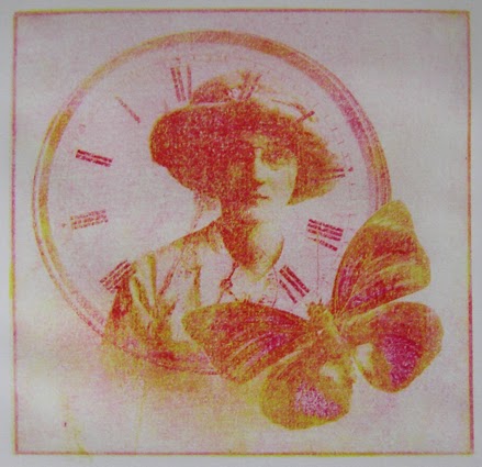
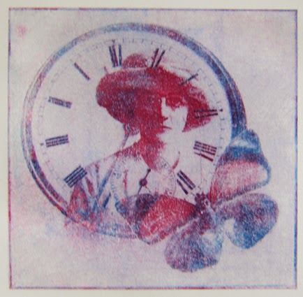
I’ve been trying overlaying transfer printing using CMYK separations.
 I don’t have process colours in litho ink so I’m going with the red, blue and yellow that I’ve got.
 I used about 50% extender to try and make the ink more transparent but I think with these colours I need to use more.
I like the effect of just the red, yellow and blue. I want to make a few more prints like these before I try overlaying the final black

Thursday, 18 September 2014

Overprinting

I’ve started to explore overlapping colour. I’ve used the whole image on both layers of some and only parts of the image on the second layer of others.
 
I like these prints where the same image has been repeated in both colours of ink


The others I'm not as happy with. Being selective with the second layer has possibilities although the areas that have only got one colour of ink look thin in comparison to the rest. I think I would like to try three colours making sure that all areas have at least two colours of ink.

Sunday, 14 September 2014

Gum Arabic Again

I can’t seem to leave the photo album alone. I think I’ve done all I want to for the time being on transparent  images...
 but I still keep playing with layering in photoshop. 

I’ve decided to explore gum arabic transfer printing with these images (I’ve done bits in the past but they are a bit hit and miss).
I wanted to persevere with my old mono laser printer to generate the paper image. In the past I’ve not had much success and have had to keep going round to the corner shop to use their very old photocopier –it can end up being very expensive and in winter you can get very wet!
Eventually I’ve managed some reasonable monochromatic prints. The next step is to start exploring layering different colours and transparencies of ink


Thursday, 11 September 2014

Blocked

I seem to have been having one of those dry spells that we all seem to have from time to time, there’s no particular reason but ideas just haven’t been flowing.

I decided that it was time to just choose one project and get to grips with it. I’m way behind with ALAW  so that seemed to be the logical choice

I had been trying to explore a fictional place through narrative but after a while I came to the conclusion that such a small format was just too difficult to fit the words in without them looking clumsy and badly spaced. I will develop the narrative idea further but not for this project.

So I started looking at old maps and started to play with black and white.
I finally chose one from 1845 when the town was starting to develop as an industrial area. There are streets and buildings on here that I recognise.

This is what I’ve posted so far


Thursday, 21 August 2014

A Fantastic Break

We’ve just got back from a family holiday with staying with friends in France (brave and generous taking in all 9 of us at once).

Big skies and beautiful views.

Markets (Bricolage for books!)

Textures of old wood and stone

Not much drawing this year but Mary, who is a sculptor and glass artist, got me a rock and I’ve been doodling in 3D. Its mostly carved, now I need to file and refine it 

We had a fantastic time. It was fun having time to catch up with old friends and meet new ones.
Then when I got back I found this waiting for me from Alison (My pen, brush and pencil) as part of ‘pay it forward’. 
A handmade sketchbook with a cover using her own marbled papers and containing her own screen prints. I can’t wait to start using it. I’m still dithering over what to produce for this swop but getting this book through the post has made me think that I need to focus

Friday, 1 August 2014

Finally finished

I now have an edition of 4 and an Artists Proof copy of "Was she the one who...?".
It needs photographing properly but today it is grey and dull. I’ll wait for sunshine.

I’ve also been working on the next set of letters for ALAW. These have to give a sense of  ‘place’.

When I was small I had several books that had fancy capital letters. They fascinated me. I want to draw on this and create a book that will have the feel of a fairy tale both in the text (creating a fantasy place) and in the presentation. Something unashamedly pretty I think, with gold (or at least gold paint).

So far I've only got experiments and an outline text. I'll need to do 2 letters a week to catch up
I’m not a writer but I’ve found that the constraint of having to use the letters of the alphabet in order and having to produce text that fits into the space has helped.

Tuesday, 22 July 2014

Stitching

I’ve printed, laminated, cut and drilled enough images to create an edition of 5 for Personal Histories. Now I need to bind them.

I thought I’d worked it out earlier using coptic stitch across the spine but when I made the first one I decided I didn’t like seeing the linking thread that joined the two rows of stitching. I also didn’t like the way that you could see the loose ends of the threads when they were cut off
I have been experimenting and have come up with this solution. 
I’ve also been experimenting with different threads (different colours and transparent) and have decided to use waxed linen. I like the way the star pattern appears up the spine and I can use the thread to link to the wrap around cover I’m thinking of using.
Unfortunately I’ve not got enough of the thread to do the five books so this will have to go on hold briefly while I source more

Monday, 14 July 2014

The Ruin

The Ruin, for Artists Books 3.0 ready to be posted out.


I thought it was finished a couple of weeks ago but just as I was about to put it in envelopes I decided it needed more of a cover.

Thursday, 26 June 2014

Productive few days

I’ve finished printing the covers and the book block for a swop through Artist Books3.0.
They are now folded, glued and are drying under weights. Hopefully these will be mailed out in a few days

I’ve also finished assembling the first alphabet for ALAW in a book. 

 It consists of 26 monoprints made with acrylic paint on a gelli plate (plus front and back covers)


 I was exploring how little of the letter was needed in order to make it ‘read’ 

Sunday, 15 June 2014

Progress of sorts

I decided to make a concerted effort with Personal Histories this week.

I finished the digital illustrations, decided on a cover, printed laminated and stitched a prototype. I liked the idea of a hole in the cover to add another layer of transparency but it doesn’t work in practice. I think I’ll probably put a title in the central panel instead (when I decide what to call it)
Most of the images work but one of the gentlemen needs a stronger surround, at the moment bits of his image are disappearing when printed 
 I used a range of colours in this version to try to decide which to use in the final book. I’ve not made any decisions yet other than not the bright blue.
 I also need to consider some kind of box or wrapping to present it in. I’m not sure whether to use translucent or semi transparent materials or whether to box/wrap it as though it had been long forgotten in some cupboard.